How to use the plots package to plot a x-ray absorption spectrum
This notebook shows how to use the plots subpackage of the aim2dat library to plot a spectrum.
[1]:
import numpy as np
import matplotlib.pyplot as plt
[2]:
x = np.linspace(0, 10, 1000)

y = (
    3 * np.exp(-((x - 1) ** 2) / 0.1**2)
    + 1.5 * np.exp(-((x - 5) ** 2) / 2**2)
    + 2 * np.exp(-((x - 7) ** 2) / 0.5**2)
    + 1.5 * np.exp(-((x - 3) ** 2) / 5**2)
    + 0.2 * np.sin(5 * np.pi * x)
)
[3]:
plt.Figure(figsize=(2, 2))
plt.plot(x, y)
[3]:
[<matplotlib.lines.Line2D at 0x7f8bf8dc5d50>]
[4]:
from aim2dat.plots.spectroscopy import SpectrumPlot

spectroscopy_plot = SpectrumPlot()
spectroscopy_plot.ratio = (4, 4)
spectroscopy_plot.import_spectrum("test", x, y, "eV")
spectroscopy_plot.import_spectrum("test05", x, 0.5 * y, "eV")
spectroscopy_plot.import_spectrum("test2", x, 2 * y, "eV")
One can import spectra via the function import_spectrum.
The Spectrum object contains several attributes including the plot properties like labels, title, storing the plot and the data. Each plot-class has the same basic structure. The following properties can be specified:
ratio: figure size (tuple)store_plot: (boolean)store_path: directory to store the plot (string)show_plot: (boolean)show_legend: (boolean)legend_loc: (int)legend_bbox_to_anchor: (tuple)x_label: (string)y_label: (string)x_range: (tuple)y_range: (tuple)style_sheet: name of style_sheet including default plot specifications (string)
Specific attributes of the Spectrum object are:
detect_peaks: (bool)smooth_spectra: (bool)plot_original_spectra: (bool)
Single plot for each data set
The simplest way to plot the spectra is to call the function plot for each element:
[5]:
spectroscopy_plot.show_plot = True
spectroscopy_plot.backend = "plotly"
for data_label in spectroscopy_plot.data_labels:
    _ = spectroscopy_plot.plot(data_label)
Multiple datasets in one plot
We can also plot multiple spectra in one plot:
[6]:
_ = spectroscopy_plot.plot(spectroscopy_plot.data_labels)
Plot each dataset in a single subplot
The function
plotalso allows to plot the spectra in separate subplots.
Using create_default_gridspec, one create a default grid with the following structure:
In case the last row is not complete, the corresponding subplots will be centered.
[7]:
spectroscopy_plot.ratio = (8, 8)

spectroscopy_plot.create_default_gridspec(2, 2, 3)

spectroscopy_plot.subplot_hspace = 0.4
spectroscopy_plot.subplot_wspace = 1.5
_ = spectroscopy_plot.plot(list(spectroscopy_plot.data_labels), subplot_assignment=[0, 1, 2])

spectroscopy_plot.backend = "plotly"
spectroscopy_plot.reset_gridspec()
Peak detection
We can detect and mark the peaks in the plot by setting the attribute detect_peaks to True:
[8]:
spectroscopy_plot.ratio = (6, 4)
spectroscopy_plot.subplot_ncols = 1
spectroscopy_plot.subplot_nrows = 1

spectroscopy_plot.detect_peaks = True

_ = spectroscopy_plot.plot("test")

spectroscopy_plot.detect_peaks = False
The detected peaks can be accessed via the peaks property and are stored in a dictionary with the corresponding data_label.
[9]:
spectroscopy_plot.peaks
[9]:
{'test': {'x_values': [0.11011011011011011,
   0.5005005005005005,
   0.990990990990991,
   1.3013013013013013,
   1.7017017017017018,
   2.1121121121121122,
   2.5125125125125125,
   2.9129129129129128,
   3.3133133133133135,
   3.7137137137137137,
   4.104104104104104,
   4.504504504504505,
   4.894894894894895,
   5.295295295295295,
   5.685685685685685,
   6.096096096096096,
   6.556556556556557,
   6.906906906906907,
   7.637637637637638,
   8.088088088088089,
   8.488488488488489,
   8.8988988988989,
   9.2992992992993,
   9.6996996996997],
  'y_values': [1.2753028157854998,
   1.3778171956807006,
   4.307310856712096,
   1.585848313972072,
   1.7009703848729834,
   1.8362939684295678,
   2.001319220011811,
   2.2002827147154207,
   2.426325468917883,
   2.656988878545343,
   2.8554855311586738,
   2.9803545786105294,
   2.9945390760666486,
   2.882108871892332,
   2.6546793874686188,
   2.408884476619347,
   2.759853330427267,
   3.5495999787851287,
   1.4027919061121286,
   0.8848716139762073,
   0.718168518822874,
   0.6064265856714756,
   0.521484133084698,
   0.4550775718142916]}}
The peaks are only displayed in the subplot of the corresponding dataset.
[10]:
_ = spectroscopy_plot.plot("test2")
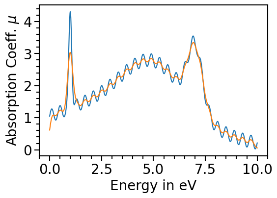
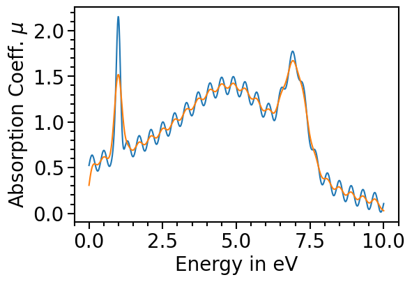
Smoothening the spectrum
In case the input data is very noisy or consists of discrete points the data can be smoothed out using different smearing methods:
[11]:
spectroscopy_plot.detect_peaks = False
spectroscopy_plot.smooth_spectra = True
spectroscopy_plot.smearing_method = "gaussian"
spectroscopy_plot.smearing_sigma = 10
spectroscopy_plot.smearing_delta = None
spectroscopy_plot.remove_additional_plot_elements()
spectroscopy_plot.show_legend = True
spectroscopy_plot.backend = "matplotlib"
The orginal data can be plotted as comparison by setting the attribute plot_original_spectra:
[12]:
spectroscopy_plot.plot_original_spectra = True
for data_label in spectroscopy_plot.data_labels:
    spectroscopy_plot.plot(data_label)